
Court Ten is an application that enables tennis players to reserve nearby courts and view their availability.
Context
Finding an open tennis court can be tough when many players gather in one spot, and having to check several city websites just to book a court only adds to the hassle.
My role
Product Designer
UX Researcher
Brand Designer
Interaction Designer
Timeline
3 weeks
The challenge
As a tennis player, I knew it was hard to find open courts. I wanted to make this easier and faster.
This was also a redesign of my first UI/UX project from high school. The goal was to keep the same flow while elevating the user experience overall.
Original screens


The solution
I realized I had to return to user research to fully understand their needs and incorporate them into my design. I also realized in order to move forward I needed to create new brand guidelines and simplify the user interface.
Key research insights
After going through research, I found I needed key features like public park availability, court bookings for the large amount of players to courts , and to find nearby public facilities.
39%
of most U.S. tennis players play at public parks, making them the No. 1 spot for tennis.
126:1
The nationwide ratio is approximately 126 tennis players for every court.
68%
of U.S. tennis facilities are public.
Wireframes
Now that I had the research down I was able to go back to the drawing board and create wireframes for what my new UI would look like.


Component and text library
I also created a comprehensive component and text library to facilitate the scalable expansion of this application's features in the future. This library includes carefully selected button styles and color schemes designed to enhance usability and maintain visual consistency throughout the interface using other tennis products as samples.

Map view and court details
Based on research indicating the necessity for courts to display live availability status and for users to access detailed court information, I designed the interface to facilitate easy viewing of court images, details, and reviews. Additionally, I streamlined the process to reach the checkout page for users who already knew their desired selections.


Court checkout
For the checkout process, I designed a streamlined and straightforward flow that captures only the essential information: date, time, court selection, and number of players. Payment is conveniently facilitated through Apple Pay, ensuring a seamless transaction experience.
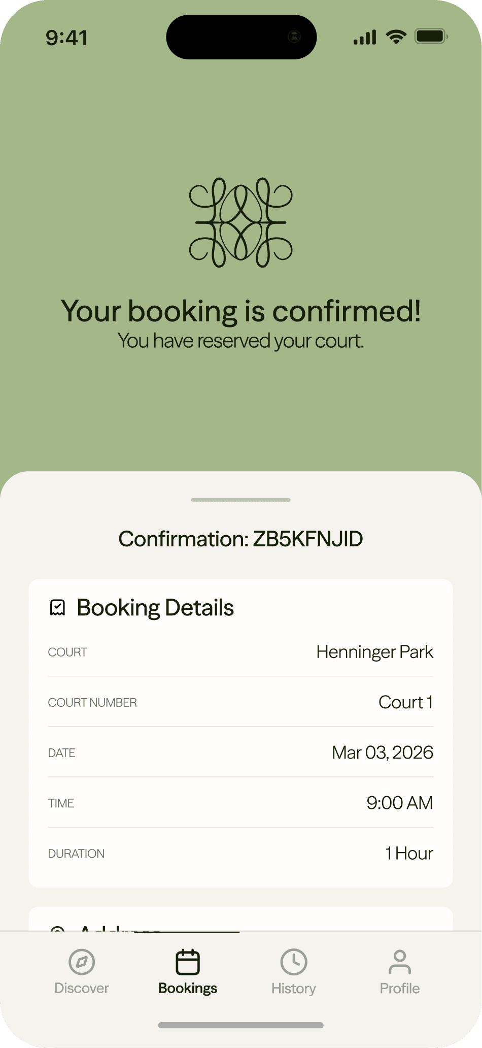
Regarding the receipt, I prioritized accessibility by enabling players to easily access their bookings and review any details they might have overlooked, thereby enhancing overall user convenience and satisfaction.




Reflection
Since this was a project redesign, I focused mainly on the core user flow. In the future I think there are opportunities to add features like connecting players who want to play tennis and linking them with potential coaches, which could lower the sport's high entry barrier.
I also learned the importance of balancing redesign efforts without disrupting existing functionality. Additionally, I encountered challenges in streamlining navigation and ensuring the interface remains intuitive. This experience taught me to better anticipate user pain points and prioritize seamless usability in future iterations.
anikashah021@gmail.com
© 2026 Anika Shah