
The New York Transit Museum's branding was redesigned to modernize its look while honoring the history of the city's transit system. The updated design blends contemporary elements with a nostalgic touch, preserving the museum's heritage in a fresh, engaging way.
Deliverables
Logo Design, Brand Development,
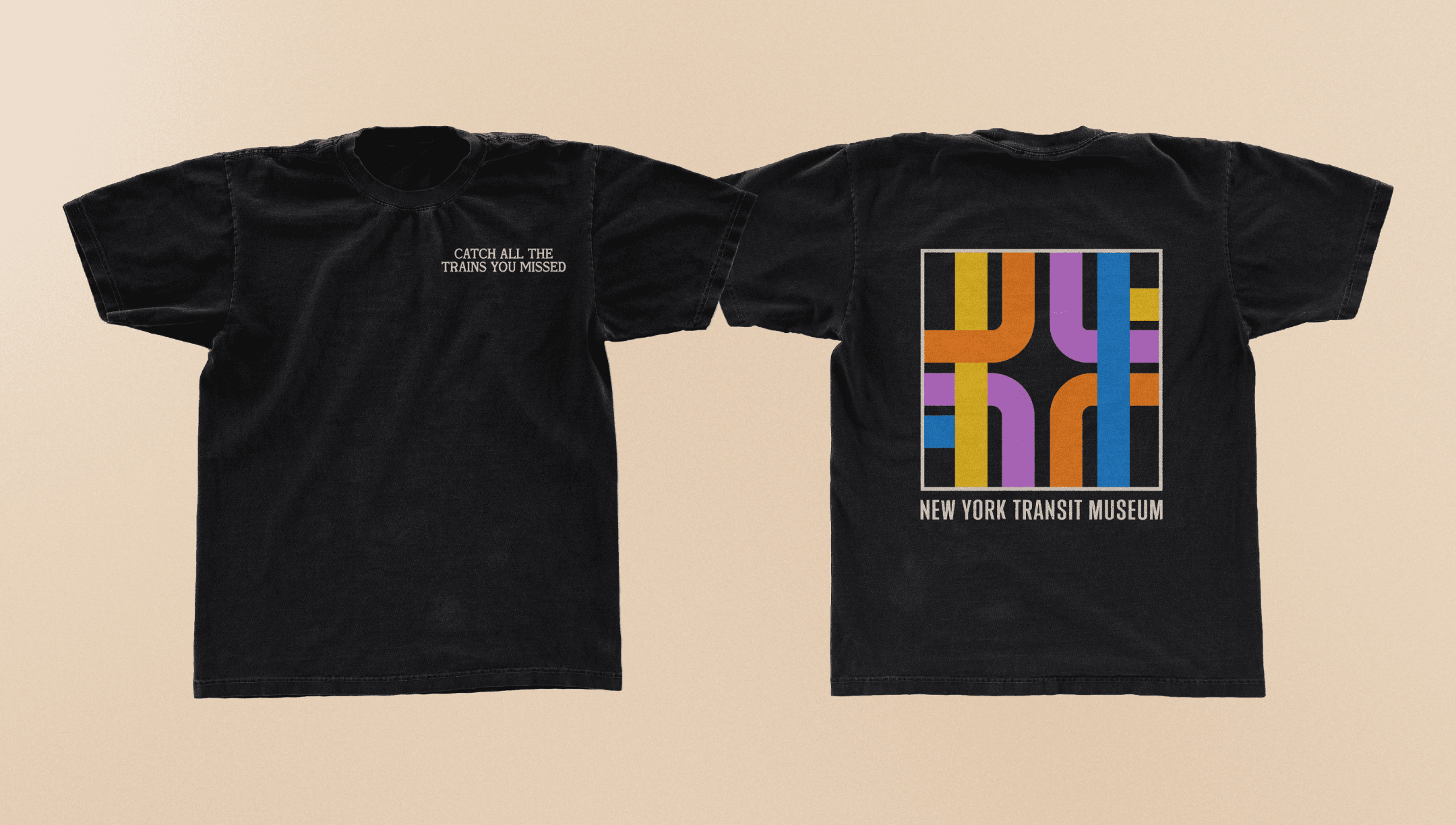
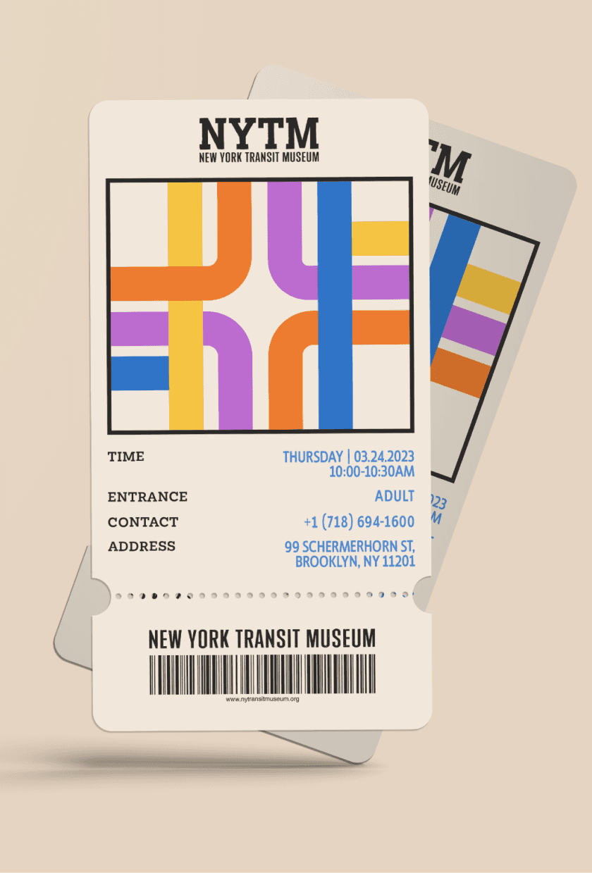
Print Collateral, Advertising, Apparel
My role
Sole Designer
Timeline
8 weeks
Year
2023

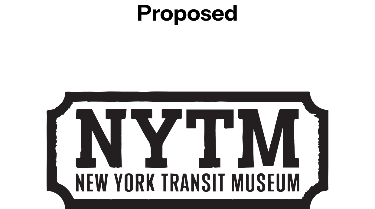
Logo
The new logo draws inspiration from the original branding of the transit system, incorporating elements reminiscent of traditional train tickets and stamps. Designed to evoke the look of a stamp, the logomark respects its heritage while introducing a modern touch.


Logo Submark
The sub-mark, used as playful visual imagery across collateral, draws inspiration from the intersecting paths of subway maps. This element also honors the museum’s history as a former transit museum. Blending these visuals in a minimal style alongside the full logo spelling appeals to a contemporary audience.


Brand Design
Influenced by the visual language of the New York Subway and Transit systems, the typography, color palette, and icon motifs anchor the museum’s identity in familiar, real-world design references.


anikashah021@gmail.com
© 2026 Anika Shah