
Right is a wellness-based fitness app that helps users ease into healthy habits and connect with a supportive community, without the intimidation of traditional fitness spaces.
Context
There’s often a sense of hesitation or fear when entering the gym or starting your fitness journey, especially if you’re returning after a break or starting for the first time.
My role
Product Designer
UX Researcher
Brand Designer
Interaction Designer
Timeline
4 weeks
The challenge
What do newcomers struggle with most when returning to fitness, and what guidance or support are they actively seeking?
Key research insights
Many newcomers feel overwhelmed by complex routines. The app should offer simple onboarding and beginner-friendly guidance to help users build confidence and sustainable habits.
> 70%
of gym goers admit they don't know what to do when they enter the gym.
45%
of users are more likely to stick with a workout plan if it includes a community or accountability feature, such as check-ins or shared goals.
68%
of users prefer workouts that require minimal equipment or can be done at home, especially in their first month back.
Understanding the user
The main challenges I addressed were reducing gym intimidation, simplifying routines, providing clear guidance, fostering community, and prioritizing mental health to boost confidence and motivation.
Information architecture
The information architecture helped prioritize the habit tracker and tutorial sections. At the core of the sitemap, I integrated key elements into the main navigation: habit tracking, mental health resources, physical training resources, and community features.
Wireframes
These wireframes highlight the prioritized navigation features. Guided by the information architecture, they helped me visualize and organize the app’s key features using a card-based layout. Creating multiple wireframe versions allowed me to explore different layouts before finalizing the screen designs.

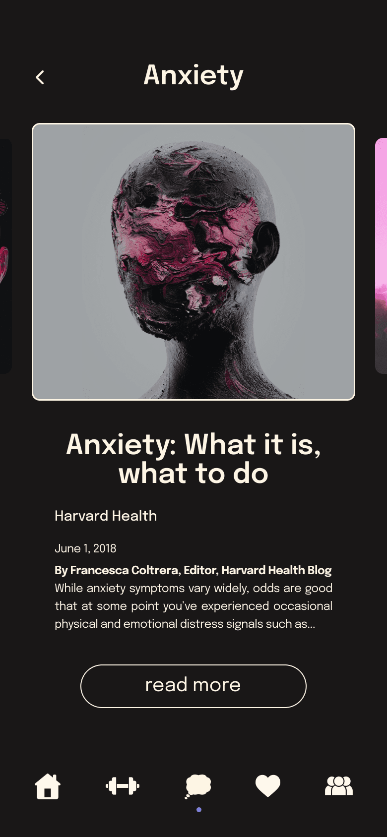
Habit tracker
Guided by research showing that trackers boost motivation and adherence, I prioritized key fitness elements: water intake, daily activity, sleep, and basic mental health metrics. The design draws inspiration from Apple’s activity rings, offering a familiar and motivating experience compatible with the Apple Watch.


Physical exercise and community
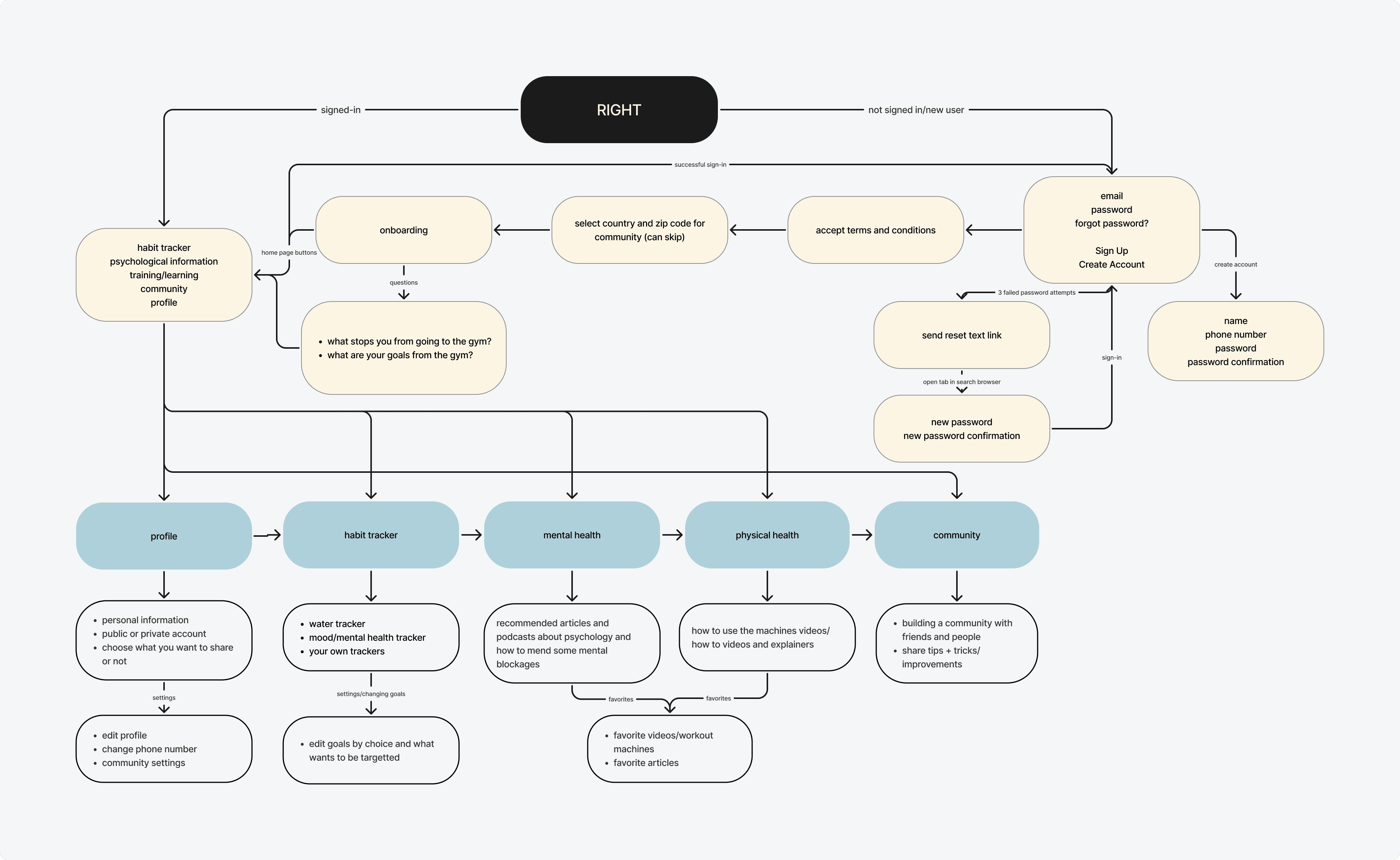
I aimed to give users the freedom to choose workouts that suit them, reducing social pressure and helping them feel comfortable. To support this, workout intensity levels are guided by community ratings.
Workouts include both video and written tutorials for accessibility, and users can share their experiences to foster a supportive, low-pressure community that promotes growth, connection, and encouragement.

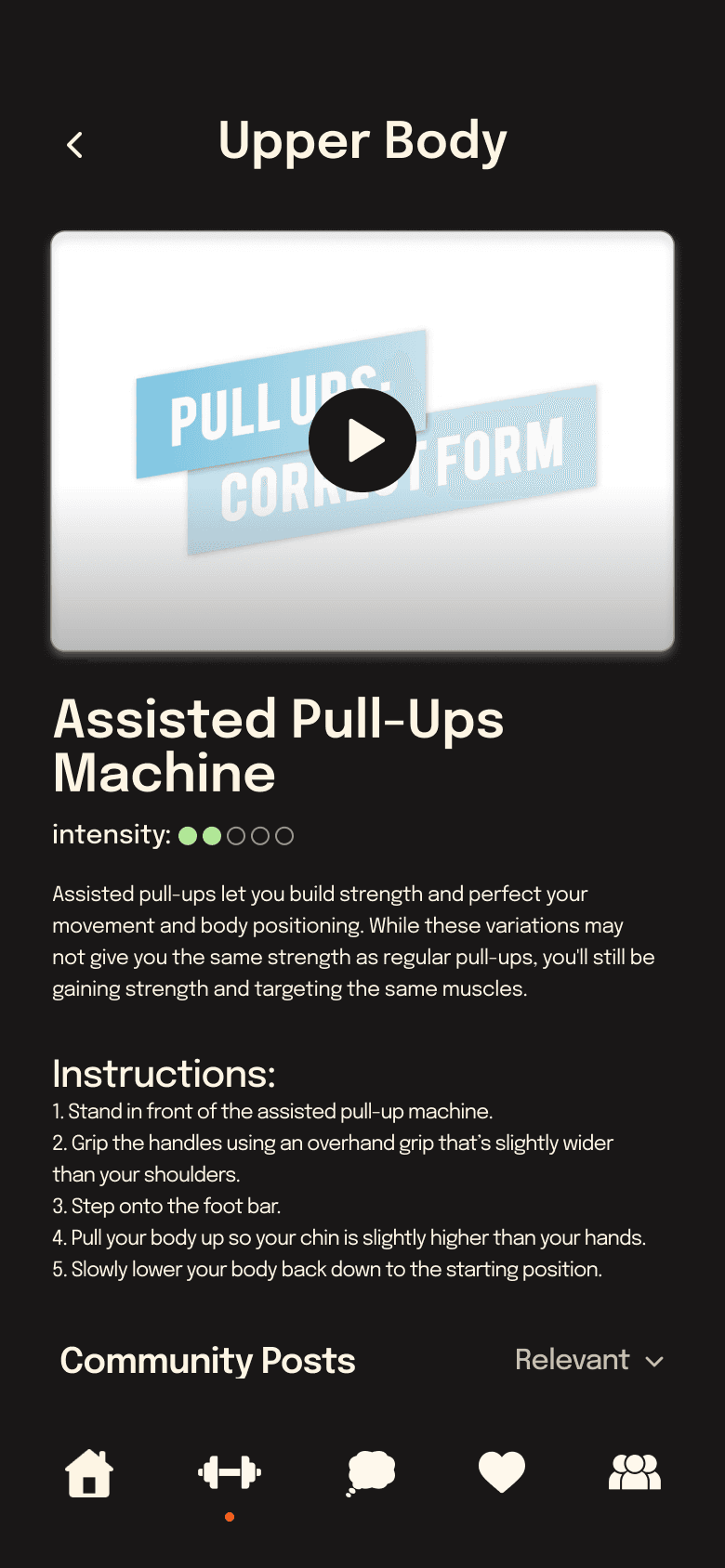


Mental health
I included mental health pages because mental well-being is as important as physical health. While this section may see less frequent use, it offers resources addressing issues that can affect users’ ability to prioritize fitness. To maintain a cohesive design, these screens mirror the style and layout of the exercise pages.


Reflection
With a tight timeline, I initially prioritized function over design but quickly realized both are equally important. If I could revisit this project, I would refine the hierarchy between elements like iconography and experiment with different card layouts to improve information flow. I’d also revisit the typography, especially for large blocks of text, to enhance readability.
Despite the time constraints, the design successfully embraced simplicity, a key priority for the fitness community, and created an encouraging, approachable experience. Users responded positively to the clear visuals and supportive features, which helped reduce intimidation and foster motivation. This project strengthened my understanding of balancing usability and aesthetics to create engaging, user-centered designs.
anikashah021@gmail.com
© 2026 Anika Shah